3 Key Tips for Choosing Highly Visible House Numbers
Homeowners don’t always think about the house numbers’ visibility. And how many are aware that house numbers are nearly always the first impression neighbors and guests encounter when approaching the residence or when looking for the address?
Often, big box retailers offer a limited selection of house numbers and letters. Many poorly crafted house address numbers also come with challenging installation issues. These factors can create major difficulties for homeowners looking to make this crucial improvement to their homes.
In this article, we will reveal the top three secrets to improving house numbers visibility for your home.
1. The Size of Your House Numbers Depends on the Distance from the Street
The first key tip is to determine the size of your house numbers based on distance. Measure the space between the mounting location and the middle of your street. This is where guests will likely first try to read your home address.
Once you have the distance from the midpoint of the street to the address number location, select the proper size for clear readability from the street. Large house numbers may be necessary depending on the distance. Use these guidelines to determine the size needed.
| Distance from Midpoint of | Recommended Minimum | This Size is Unreadable at |
| Street to Number Location | House Numbers Height | Distances Greater than … |
| Zero – 69 feet | 3 inches or larger | 100 feet |
| 70-110 feet | 4 inches or larger | 150 feet |
| 111-132 feet | 5 inches or larger | 175 feet |
| 133-160 feet | 6 inches or larger | 200 feet |
| 161-300 feet | 8 inches or larger | 350 feet |
| 301-385 feet | 10 inches | 450 feet |
Note: The height of the house number is measured from the top of the number to the bottom of the number. Signage rules concerning vehicle speed and the number of car lanes do not typically apply to house numbers since guests typically slow down in residential areas to find house numbers.
2. Improve House Numbers Visibility with Contrasting Colors or Finish
The second key tip to selecting the perfect house numbers for visibility is to ensure that the finish and/or color of the address numbers you select to install have a sharp contrast to the surface that you intend to mount them upon.
When high contrasting house address numbers are utilized, the visibility and impact of the house numbers rise significantly. But when colors and/or finishes are similar to the background where they are to be mounted, your address will be impossible to see at any distance.
Homeowners with address numbers mounted far from the street should choose high-contrast colors for visibility. Ideal colors include white, black, red, and metallic shades like nickel and silver. These options help ensure the house numbers stand out from a distance.
Today, homeowners may also choose reflective house numbers and lighted or illuminated house numbers for added visibility.
3. Choose the Right Font Style for your House Numbers

The final tip to choosing the perfect house numbers for your residence is to carefully consider the impact of the type of font you select.
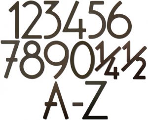
Decorative, thin font styles, script fonts, and serif-style fonts will decrease the visibility of your address. For instance, vintage and Victorian house numbers often have a highly stylized design. Art Deco house numbers also feature intricate styles that can be hard to read from a distance.
Thick sans serif fonts (like Helvetica) will maximize the visibility of your house numbers. The MailboxWorks offers many modern and contemporary house numbers. These designs are specifically crafted for high visibility.
Style-conscious homeowners might prefer a unique font style for their house numbers, even if it compromises readability. However, safety-conscious homeowners recognize the importance of clear visibility. It’s not only guests who could miss the address but also emergency responders in a crisis. Thus, readability is vital.
Even the spacing between the house numbers when you mount them is crucial to readability (designers call this spacing “kerning”). When your house numbers are mounted too close to each other, the lack of space between the numbers creates visibility issues.
Conversely, when you mount the numbers too far apart, they may not appear as a single numeral like “12031.” Instead, they might look like separate numbers, such as “1” “2” “0” “3” “1” or even different addresses like “120” and “31,” which can confuse visitors trying to locate your home.
Make Your Address Stand Out with the Perfect House Numbers
Ensuring house numbers visibility isn’t just about aesthetics. It’s about functionality, safety, and making a lasting impression. By selecting the right size, color contrast, and font style, you can enhance curb appeal while ensuring guests, deliveries, and emergency responders can easily find your home.
Don’t let poorly visible house numbers become a frustration. Upgrade your home’s exterior with high-quality, easy-to-read address numbers that combine style and practicality.
Explore our premium collection of house numbers today! Visit our online store or call 1-866-717-4943 for expert advice on choosing the perfect set for your home. Shop now and make your address unforgettable!
Tags: Address Plaques & House Numbers, Home ImprovementCategorized in: Mailbox Tips & General Information


